Python - matplotlib によるグラフ表示
公開日:2019-06-26
更新日:2019-07-01
更新日:2019-07-01
1. 概要
2. グラフの基本
2-1. シンプルな折れ線グラフ
グラフデータを配列で plot() に渡して、show() でグラフを表示します。
グラフの表示範囲は、自動的に調整されます。
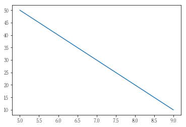
グラフの表示範囲は、自動的に調整されます。
import matplotlib.pyplot as plt

x_list = [ 5,  6,  7,  8,  9]
y_list = [50, 40, 30, 20, 10]

plt.plot(x_list, y_list)
plt.show()
2-2. 書式の設定
線種、色、凡例、軸のタイトル、グラフの表示範囲を設定します。
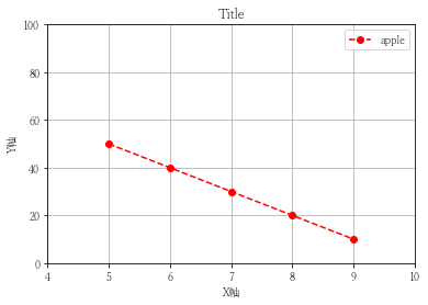
import matplotlib.pyplot as plt

x_list = [ 5,  6,  7,  8,  9]
y_list = [50, 40, 30, 20, 10]

# グラフのタイトル
plt.title('Title')

# 軸のラベル
plt.xlabel('X軸')
plt.ylabel('Y軸')

# グラフの表示範囲
plt.xlim([4, 10])
plt.ylim([0, 100])

# グリッドの表示
plt.grid()

# 書式
marker = 'o' # [.,o]:丸 [v^<>1234]:三角 p:五角形 *:星 [hH]:六角形 [dD]:ダイヤ [+x_|]:そのまま出る
line   = '--' # - -- -. :
color  = 'r' # b:青 g:緑 r:赤 c:シアン m:マゼンダ y:黄 k:黒 w:白
fmt = marker + line + color

# グラフデータの設定
plt.plot(list(x_list), list(y_list), fmt, label = 'apple')

# 凡例の表示
plt.legend()

# グラフの表示
plt.show()
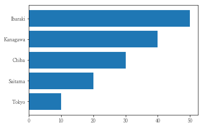
2-3. 棒グラフ
import matplotlib.pyplot as plt

plt.bar(
    ['Tokyo', 'Saitama', 'Chiba', 'Kanagawa', 'Ibaraki'],
    [10, 20, 30, 40, 50]
)
plt.show()
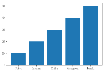
bar() を barh() にすると、横の棒グラフになります。
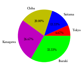
2-4. 円グラフ
import matplotlib.pyplot as plt

plt.pie(
    [10, 20, 30, 40, 50],
    labels = ['Tokyo', 'Saitama', 'Chiba', 'Kanagawa', 'Ibaraki'],
    colors = ['r'    , 'b'      , 'y',     'm',        '#00ff00'],
    autopct = "%1.2f%%",
    textprops = {'weight':"bold"},
)
plt.show()
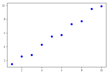
2-5. 散布図
import matplotlib.pyplot as plt

x_list = range(1, 11)
y_list = [ 1.5, 2.6, 2.8, 4.3, 5.5, 5.7, 7.3, 7.7, 9.5, 9.9]

plt.scatter(x_list, y_list, c='b')
#plt.plot( x_list, y_list, 'b*')

plt.show()
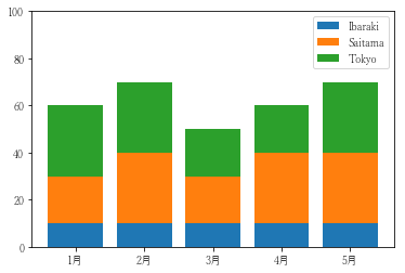
2-6. 積み上げ棒グラフ
import numpy as np
import matplotlib.pyplot as plt

# 目盛りの値の設定
x_list = [0, 1, 2, 3, 4]
y_list = np.arange(0, 101, 20)

# グラフの値
tokyo   = [30, 30, 20, 20, 30]
saitama = [20, 30, 20, 30, 30]
ibaraki = [10, 10, 10, 10, 10]

# 一番に積み上がる棒グラフのかさ上げ用
tokyo_bottom = np.array(saitama) + np.array(ibaraki)

# グラフデータの設定
plt.bar(x_list, ibaraki, label = 'Ibaraki')
plt.bar(x_list, saitama, label = 'Saitama', bottom = ibaraki)
plt.bar(x_list, tokyo,   label = 'Tokyo'  , bottom = tokyo_bottom)

# 目盛りの設定
plt.xticks(x_list, (['1月', '2月', '3月', '4月', '5月']))
plt.yticks(y_list)

# 凡例の表示
plt.legend()

# グラフの表示
plt.show()
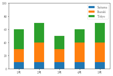
pandas を使うと、簡単に表示することができます。
import pandas as pd
import matplotlib.pyplot as plt

plt.rcParams["font.family"] = 'Yu Mincho'

df = pd.DataFrame(
    [
        [10, 20, 30],
        [10, 30, 30],
        [10, 20, 20],
        [10, 30, 20],
        [10, 30, 30]
    ],
    index   = ['1月', '2月', '3月', '4月', '5月'],
    columns = ['Saitama', 'Ibaraki', 'Tokyo']
)

df.plot.bar(stacked = True, yticks = range(0, 120, 20), rot = 0)
#df.plot(kind = 'bar', yticks = range(0, 81, 10))
#df.plot(kind = 'line', yticks = range(0, 51, 10))

plt.show()
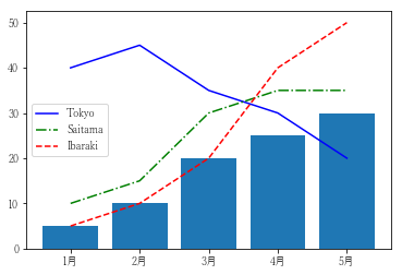
3. 1つのグラフに複数のグラフ表示
他のグラフを plot() するだけで、グラフを重ねることができます。
import matplotlib.pyplot as plt

x_list = range(0, 5)

plt.plot(x_list, [40, 45, 35, 30, 20], 'b'  , label = 'Tokyo')
plt.plot(x_list, [10, 15, 30, 35, 35], '-.g', label = 'Saitama')
plt.plot(x_list, [ 5, 10, 20, 40, 50], '--r', label = 'Ibaraki')
plt.bar (x_list, [ 5, 10, 20, 25, 30])

plt.xticks(x_list, (['1月', '2月', '3月', '4月', '5月']))
plt.legend()
plt.show()
4. 複数のグラフ表示
plt.subplots() で、複数のグラフを作成できます。

以下のように、plt.plot() で設定することもできる。
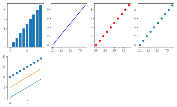
import matplotlib.pyplot as plt
import numpy as np

x_list = range(0, 10)
y_list = x_list

np.random.randint(4, 10, (2, 1))

# 2行4列 のグラフの作成
(fig, ax) = plt.subplots(2, 4, figsize = (10, 6))

fig.suptitle('Title')

ax[0, 0].bar    (x_list, y_list)
ax[0, 1].plot   (x_list, y_list, 'b')
ax[0, 2].plot   (x_list, y_list, 'ro')
ax[0, 3].scatter(x_list, y_list)

# 1つのグラフに重ねることもできる
ax[1, 0].bar    (x_list, y_list)
ax[1, 0].plot   (x_list, np.array(y_list) + 5)
ax[1, 0].scatter(x_list, np.array(y_list) + 10)

# 普通にプロットすると、一番最後のグラフに設定される
plt.bar (x_list, x_list)
plt.plot(x_list, y_list)

plt.show()
以下のように、plt.plot() で設定することもできる。
import matplotlib.pyplot as plt
import numpy as np

x_list = range(0, 10)
y_list = x_list

np.random.randint(4, 10, (2, 1))

# グラフの作成
fig = plt.figure(figsize = (10, 6))

rows = 2
cols = 4

plt.subplot(rows, cols, 1)
plt.bar(x_list, y_list)

plt.subplot(rows, cols, 2)
plt.plot(x_list, y_list, 'b')

plt.subplot(rows, cols, 3)
plt.plot(x_list, y_list, 'ro')

plt.subplot(rows, cols, 4)
plt.scatter(x_list, y_list)

plt.subplot(rows, cols, 5)
plt.plot   (x_list, y_list)
plt.plot   (x_list, np.array(y_list) + 5)
plt.scatter(x_list, np.array(y_list) + 10)

plt.show()
5. pandas によるグラフ表示
Series、DataFrame のオブジェクトから簡単にグラフ表示ができます。
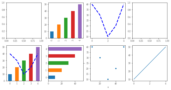
import pandas as pd
import matplotlib.pyplot as plt

# 2行4列のグラフ群の作成
(fig, ax) = plt.subplots(2, 4, figsize = (10, 6))

# グラフデータ
s1 = pd.Series([10, 20, 30, 40, 50])
s2 = pd.Series([40, 30, 10, 20, 40])

# グラフデータ(散布図用)
df = pd.concat([s1, s2], axis = 1)
df.columns = ['x', 'y']

# グラフ表示
s1.plot(ax = ax[0, 1], kind = 'bar')
s2.plot(ax = ax[0, 2], kind = 'line', style = 'b--', lw = 3)
s1.plot(ax = ax[1, 0], kind = 'bar')
s2.plot(ax = ax[1, 0], kind = 'line', style = 'b--', lw = 3)
s1.plot(ax = ax[1, 1], kind = 'barh')
df.plot(ax = ax[1, 2], kind = 'scatter', x = 'x', y = 'y')

# ax を指定しないと、最後のグラフに設定される
s1.plot()

plt.show()
6. グラフのファイル出力
plt.savefig() で Figure 単位でグラフを保存できます。
また、plt.show() をすると、新しいグラフが作成されるため、
savefig() の前で show() しないようにしてください。
また、plt.show() をすると、新しいグラフが作成されるため、
savefig() の前で show() しないようにしてください。
import matplotlib.pyplot as plt

plt.plot([5,  6,  7,  8,  9])
plt.savefig('test.png')

